The single one most powerful asset that makes strong images is the use of light and shadows, and the endless possibilities that it can add to a scene. In this article, we will look at what shadow photography refers to, some common forms in which light and shadow are used to enhance an image’s composition, and the works of great photographers who are widely known to be masters of light and shadows.
If you find this helpful, SUBSCRIBE to my channel via the box on the left to make the most out of my blog! Also, do share it with people who might be interested. Shoot me an email/ DM to share your thoughts too.
Also, Pin this article to your Photography Techniques/ Photography Inspiration boards in Pinterest if you find it helpful!
For a deep-dive into the work of the master of light, Fan Ho, watch my video analysis here:
Shadow Photography Definition
Shadow photography is an approach in photography in which shadows is a material component of the composition. It is used by the photographer intentionally to achieve the designated aesthetics. Shadows can be incorporated in forms of silhouettes, lines, sub-frames, stand-alone objects and simply to add texture to a given subject. Shadows in photography are often accompanied by areas of strong highlights, as shadows are often produced in harsh lighting situations such as noon time or sunset time. It is most commonly used in street photography, sometimes in portraiture by great photographers.
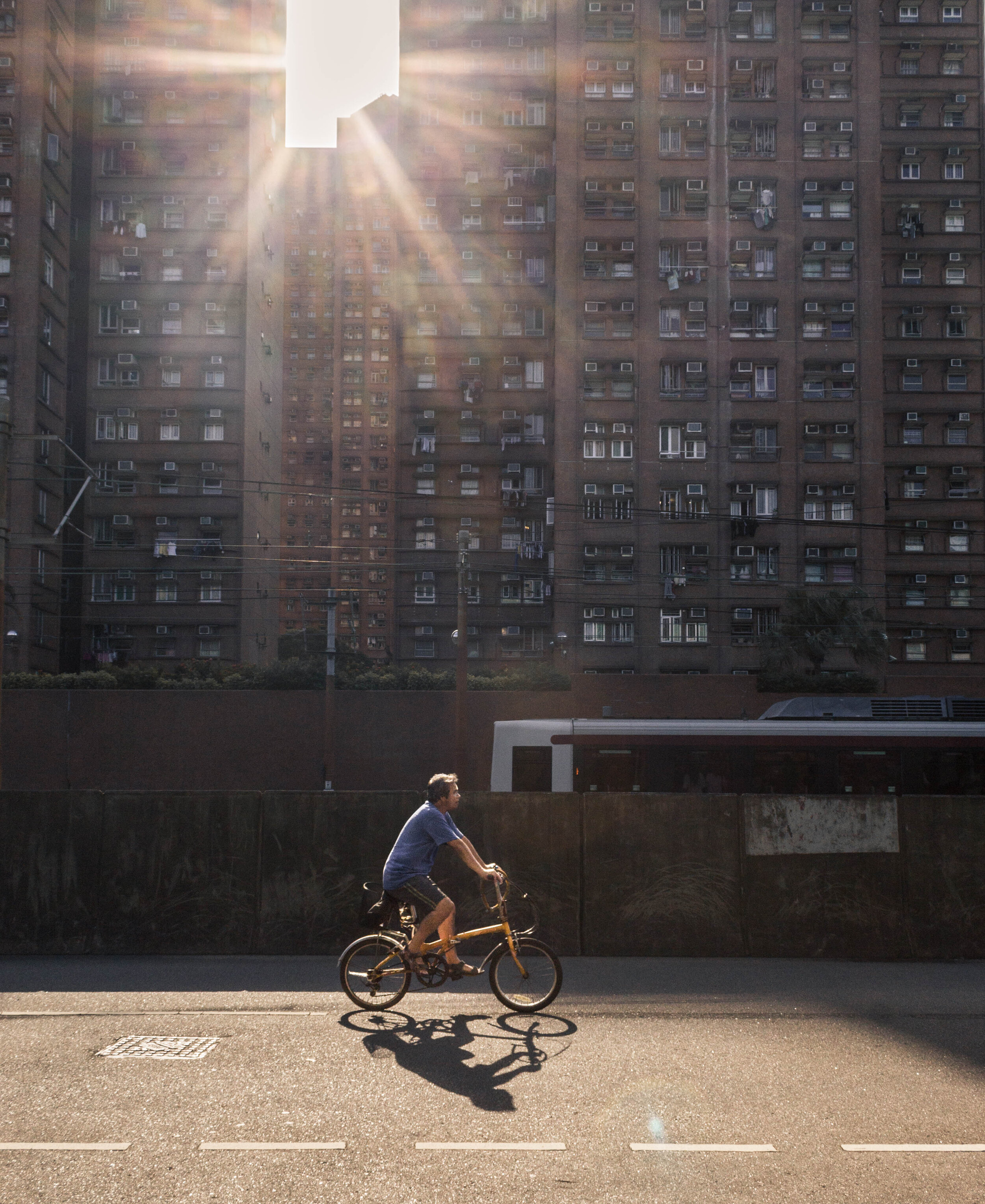
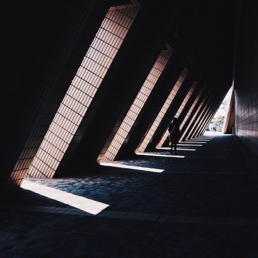
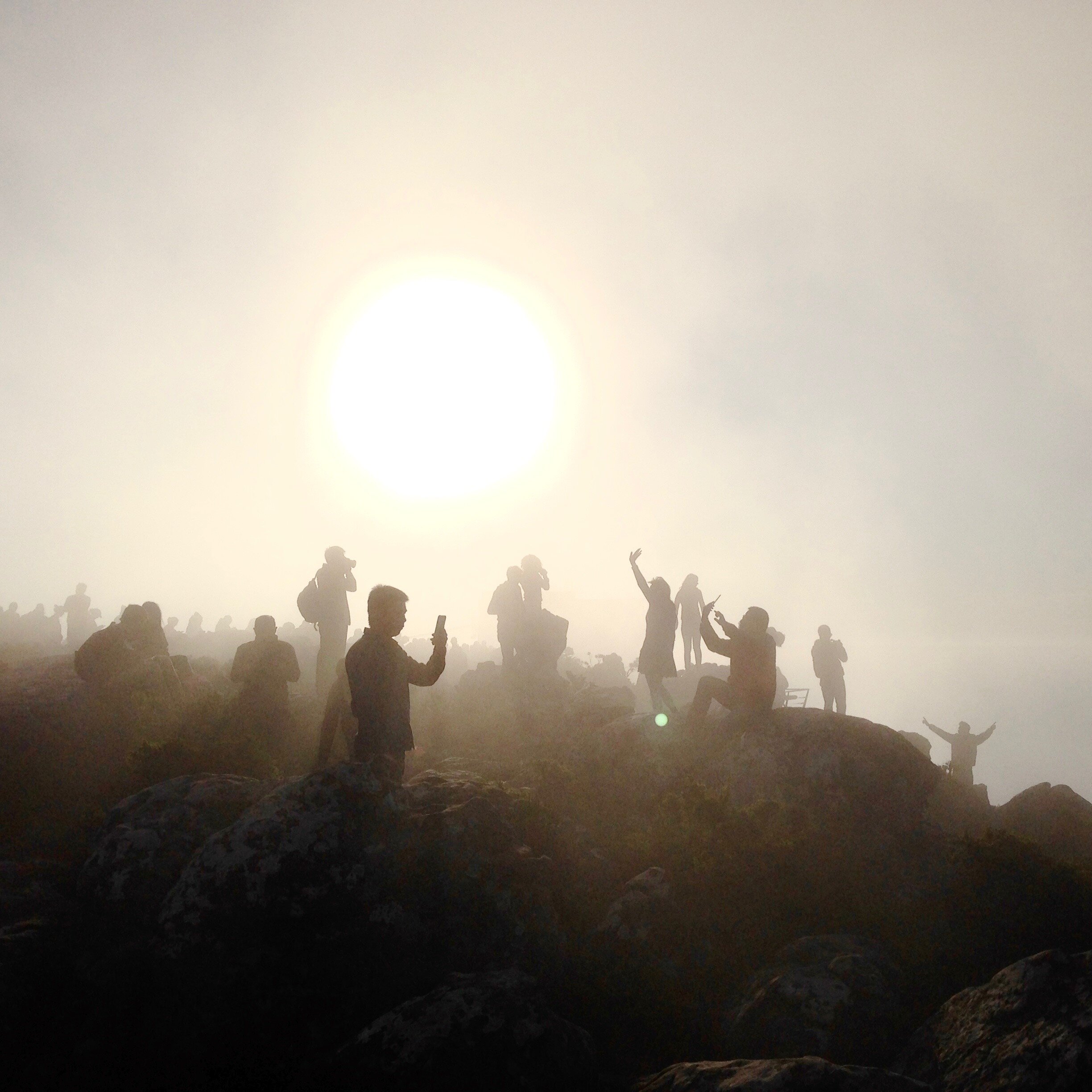
Here are examples taken from my work to help you visualise the type of images the approach could result in.
Shadow Photography Techniques
Shadows come in various forms and sizes, and therefore result in different visual effects when used in different ways, such as creating silhouettes, forming objects in themselves, adding texture to the subject, forming sub-frames, among others. The following is a summary of the most common means in which shadows operate to further the composition of an image, drawing from the works of various great photographers, especially street photographers.
Silhouettes
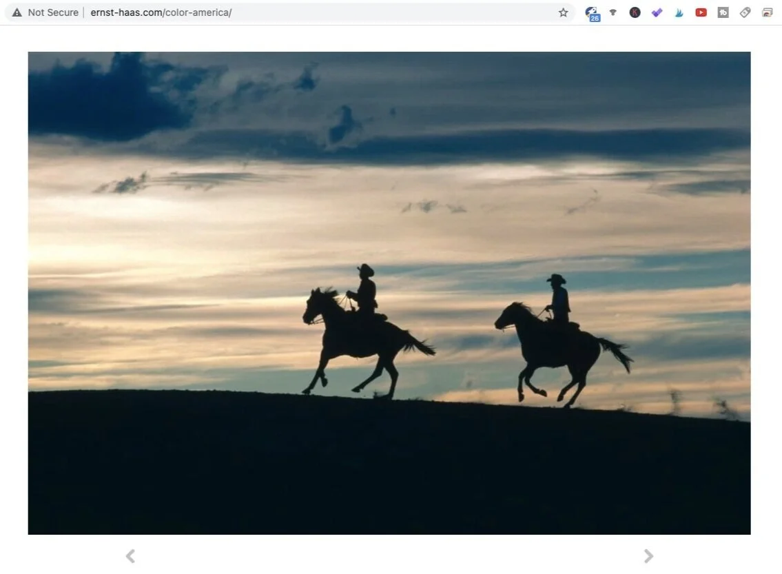
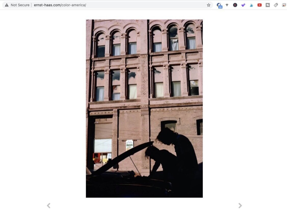
Silhouettes are readily created in high-contrast lighting situations. Especially with cameras that has a relatively narrow dynamic range, it can only expose for either the bright parts or the shadows. Where the photographer elects to expose for the highlights, the shadows consequently drop into deep shadows and in extreme cases even blacks.
The effect of silhouettes can be accentuated in post-production as well, by dropping the exposure of shadows further. This will wipe out even more details in those shadows, forming near-black shapes.
New Mexico (1981). Photo by Ernst Haas. Screen shot taken from Ernst Haas Estate.
Stand-alone Objects
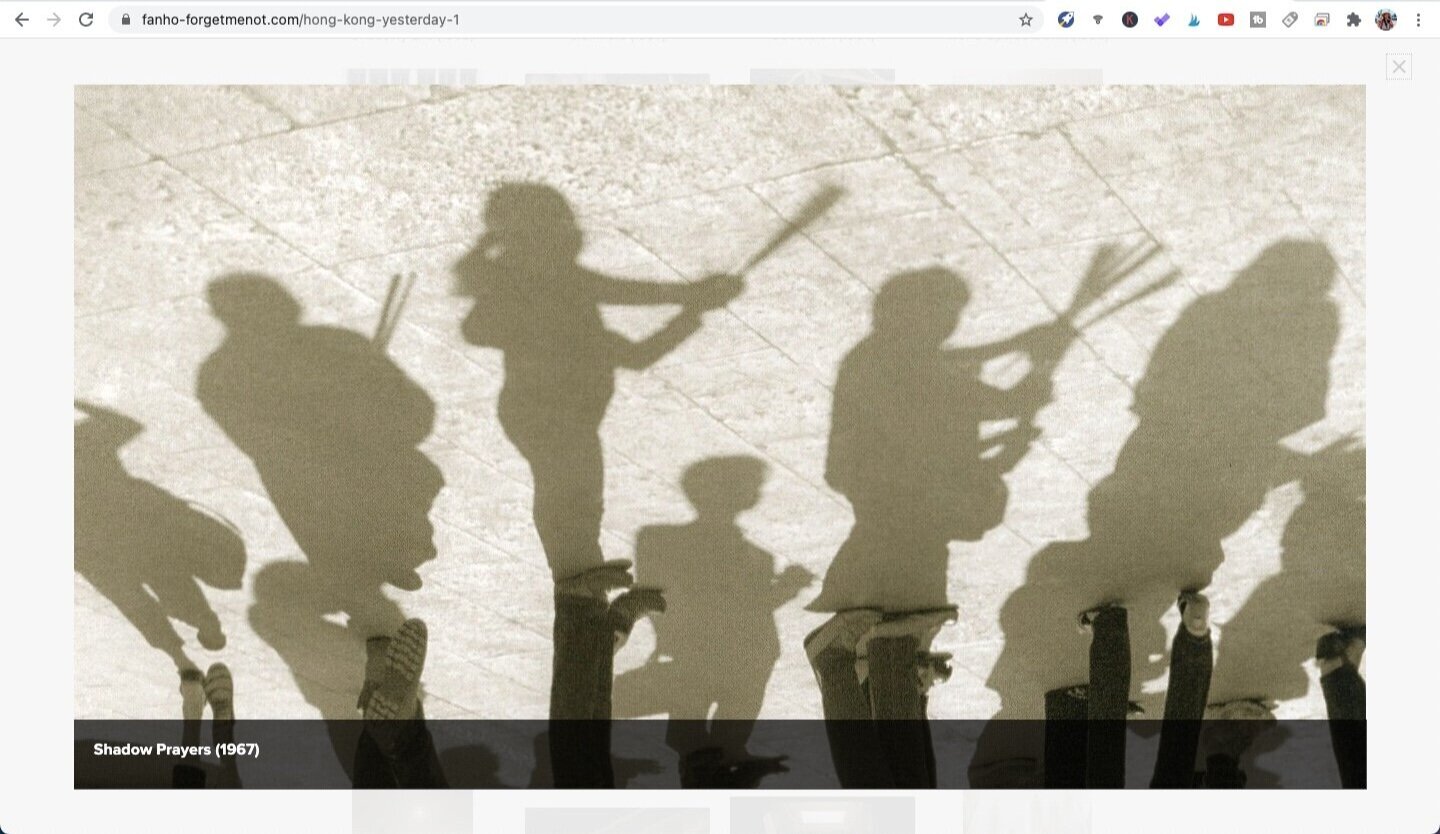
Shadows are often positioned close to the object and is somewhat attached to the object. But in certain situations, specifically where the light source of intense and low, the shadow becomes more elongated and only has minimal contact with the subject. By positioning himself at appropriate angles relative to the object, the photographer would be able to isolate the shadow alone and create an image in which the shadow acts as the main focal point.
It would also require the presence of a somewhat light surface onto which the shadow hits. Shadows are not always apparent in camera. In order for it to be effectively separated from its surroundings, ideally there would be a surface which allows the shadow to be fully visible.
Shadow Prayers (1967). Photo by Fan Ho. Screen shot taken from Fan Ho Official Website.
Add texture
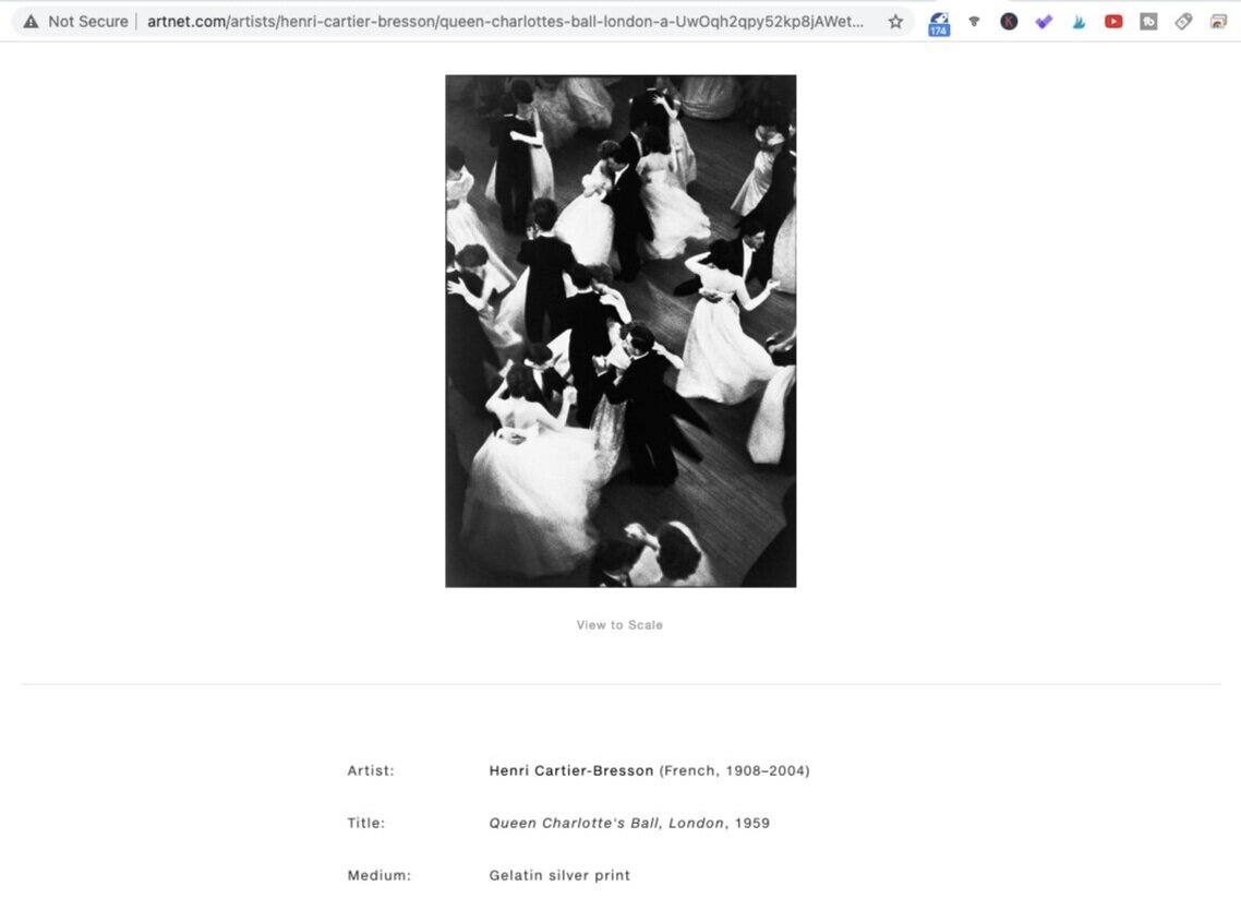
In most scenarios, the light might not be strong enough and concentrated enough to create shadows with distinct boarders. Lighting usually exists in a more subtle and diffused form, and where it hits onto a textured material, the resulting shadows could be a projection of such textures. Common examples of this is the shadows created by light shining through leaves, transparent curtains, mosaic glass panes. Anything that would create patterns in the shadow could be placed between the light source and the subject to add more interest.
Queen Charlotte’s Ball (1959). Photo by Henri Cartier-Bresson. Screen shot taken from Artnet.com.
Create Sub-framing
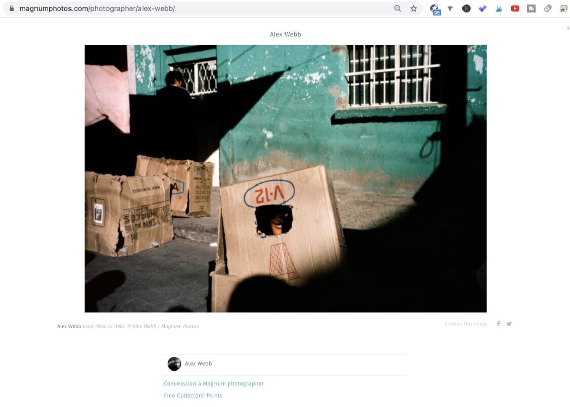
Sub-framing refers to a technique in which the photographer marks out a smaller frame within the image, which emphasises the protagonist(s), subtly creating a separation of it from other elements of the image. Light and shadows is but one of the ways in which sub-frames can be created.
The use of light and shadows, in fact, is arguably the most straightforward way of achieving such an end. The human eye is most naturally drawn to brighter areas in a given image. This is further enhanced by the presence of deep shadows, which causes the highlights to stand out even more.
Leon, Mexico (1987). Photo by Alex Webb. Screen shot taken from Magnum Photos.
Geometry & Lines
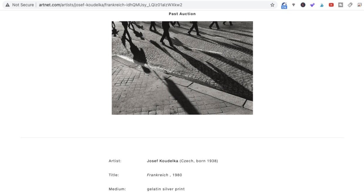
Geometry here refers to quite a broad class of elements, but most commonly shapes and lines in the context of photography. While this edges towards a more fine-art understanding of the making of a good photography, most schools of photography agree, albeit to varying extents, that geometry is an effective way to explain and achieve balanced compositions.
The role played by shadows is more easily understood - objects would cast shadows on the floor or surfaces, which could create lines to complete the geometry in a given shot. In other situations, large, bulky objects create a shadow in form of a shape, which blots out a profound area in frame. Whereas for light, most of the time it appears in form of negative space, filling in areas that are not taken up by shadows.
Frankreich (1980). Photo by Josef Koudelka. Screen shot taken from Artnet.com.
Photographers who use Shadows extensively
See below a list of photographers who incorporated light and shadows extensively in their compositions, in no particular order. Photographers who are featured include Fan Ho, Henri Cartier-Bresson, Ernst Haas, Alex Webb, Martin Munkácsi and Fred Herzog. They are from a variety of eras, ranging from late 20th century, to war times and finally, today.
Fan Ho
Fan Ho has made a name for his masterful understanding of light and its incorporation to create other-worldly compositions in his work. From the above listed typical techniques, light and shadows mostly appear in his images in form of adding texture, sub-framing and geometry. The following is a brief analysis of how he does so.
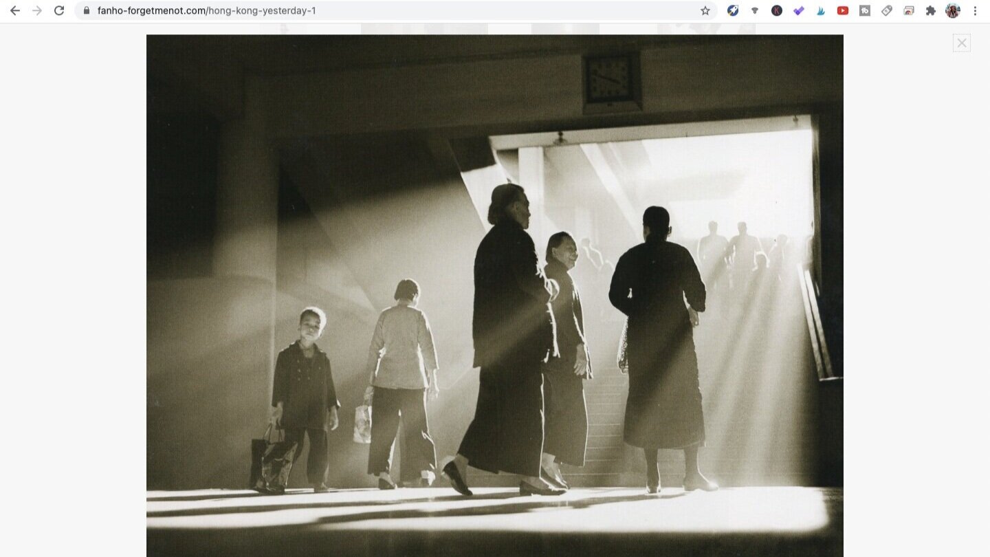
Afternoon Chat (1959). Photo by Fan Ho. Screen shot taken from Fan Ho Official Website.
In this image, the presence of the light rays created a layered texture to the shadows in the image. The sense of depth was further enhanced by the haze: the closest subjects appeared in the darkest shadows, whereas people further down appeared in lighter shadows.
Mother’s Helper (1967). Photo by Fan Ho. Screen shot taken from Fan Ho Official Website.
I have categorised the use of shadows in this image as a sub-frame. There certainly are other roles played by shadows in this image but what is worth noting is the fact that the shadows worked like a spot light on the little boy and his broom. The shape and position of the shadow complemented the point of the image perfectly. The fact that a bit of light fell onto the baby boy on the left, which broke the straight boundary of the shadow, was a pleasant addition of interest in the image.
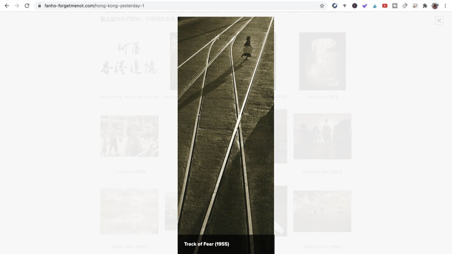
Track of Fear (1955). Photo by Fan Ho. Screen shot taken from Fan Ho Official Website.
In this image, the light hitting onto and reflecting from the metal rails on the floor formed curves and lines that gave the image a dynamic quality. It created a sense of direction, directing the eyes towards where the girl was moving.
The work of Fan Ho has been analysed in greater detail the video above. For a more thorough look at his work, please refer to the video.
Many of the iconic shots of Fan Ho has been printed in his book “Portrait of Hong Kong”. Check out its latest price on Amazon via the link.
Henri Cartier-Bresson
With reference to Henri’s entire body of work, the way he uses light and shadows largely fall into the category of geometry. Specifically, the use of shadows as shapes. This is not surprising given his background as a properly trained artist, which instilled in him a strong sense of geometry. He has also repeatedly stressed the importance of geometry in the creation of good compositions.
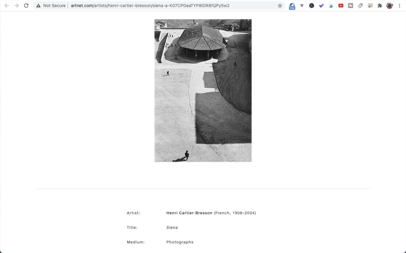
Siena. Photo by Henri Cartier-Bresson. Screen shot taken from Artnet.com.
In this image, the shadows cast on the floor by the buildings formed profound shapes, which was in a stark contrast with the tiny, thread-like shadows cast by the men. It shows the sense of space through the use of shapes.
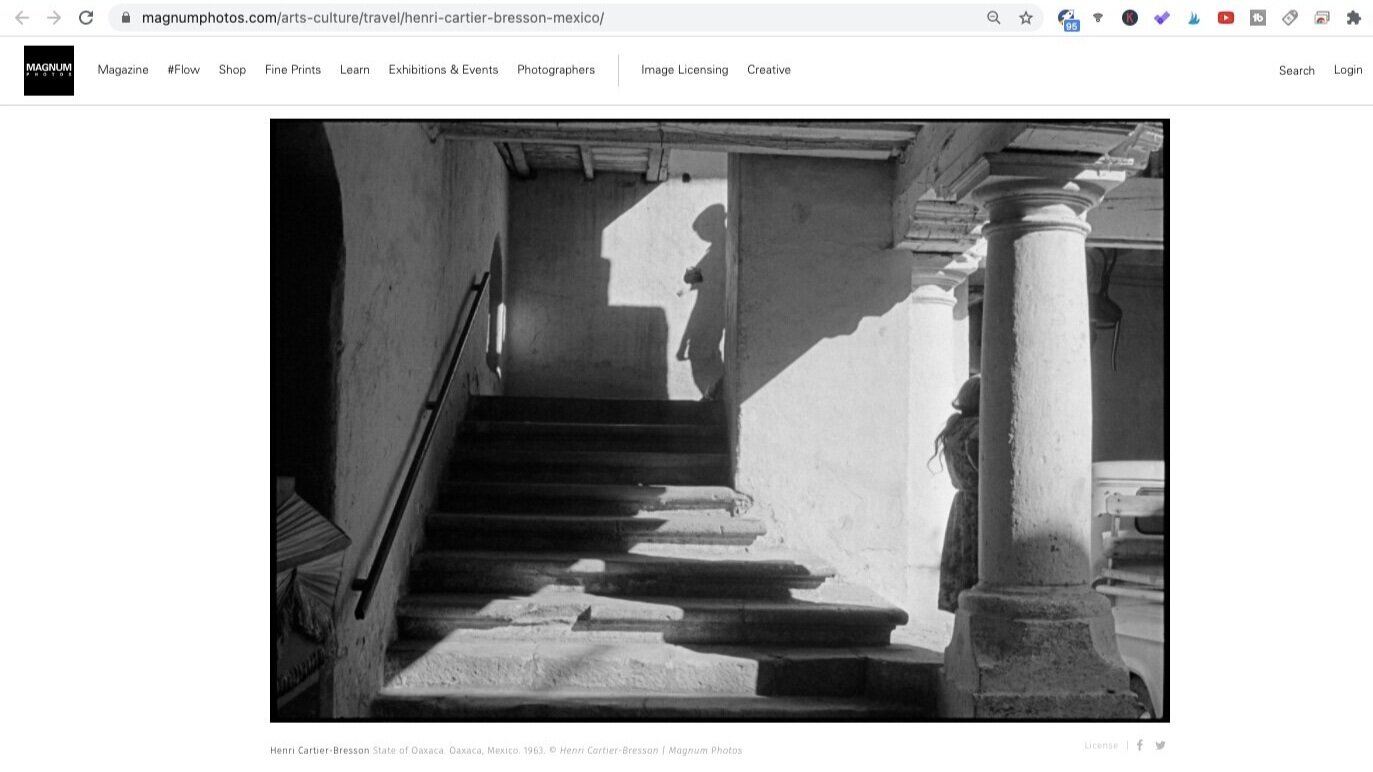
State of Oaxaca (1963). Photo by Henri Cartier-Bresson. Screen shot taken from Magnum Photos.
In this image, the Henri made use of the split between areas of shadows and light as a cross, which divided the frame into four implied triangular sections. The alternation between the areas of light and shadows then enabled subjects to be placed inside the composition, creating this dramatic light and shadows sensation.
Ernst Haas
Ernst Haas is a very different photographer from the two we have covered above and also in the video, and while he certainly does use shadows in some similar ways as Fan Ho and Bresson, shadows are most often shown in his images as silhouettes and are even sometimes subjects in itself.
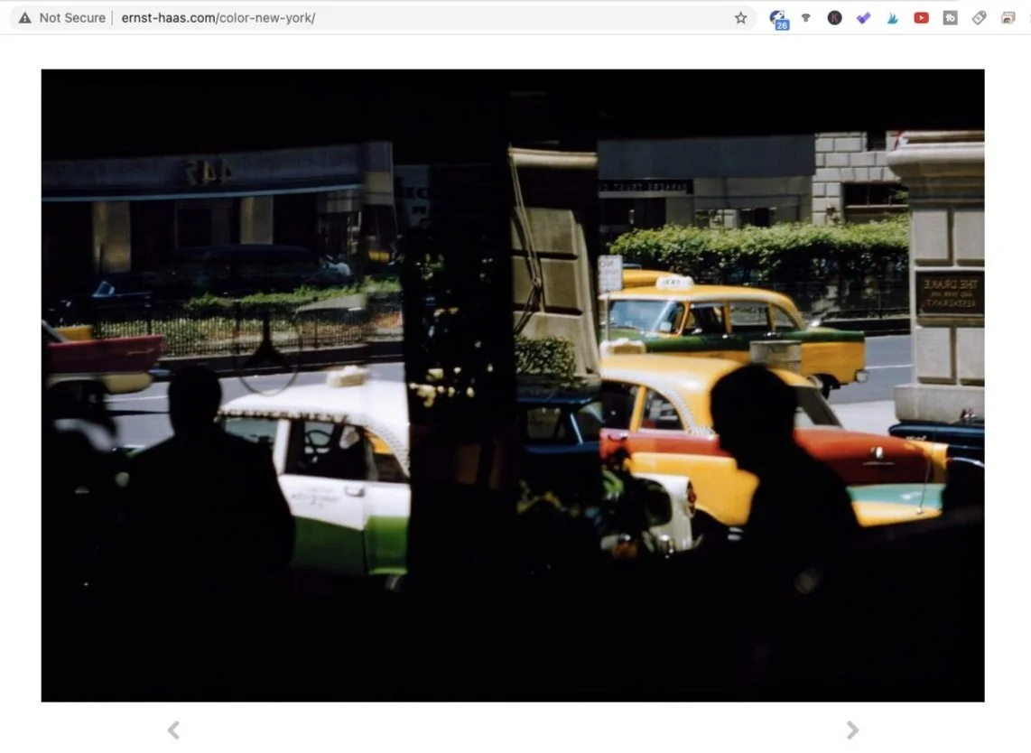
Park Avenue (1952). Photo by Ernst Haas. Screen shot taken from Ernst Haas Estate.
Ernst Haas had an interesting spread of styles across various types of subject matter but this is an example for what he is the most known for: vibrant and yet contrasted street shots of America. As you can readily observe, the two men, one each on the left and right (imagined) compartments of the frame, were dropped into dark silhouettes.
USA (1970). Photo by Ernst Haas. Screen shot taken from Ernst Haas Estate.
Ernst Haas does enjoy telling stories and creating a sense of mystery therein, by showing his subjects in form of silhouettes. As I would imagine, this image was taken under strong daylight, but apart from the technical standpoint, the treatment of silhouettes leaves room for the viewer to ponder on what was going on in the shot.
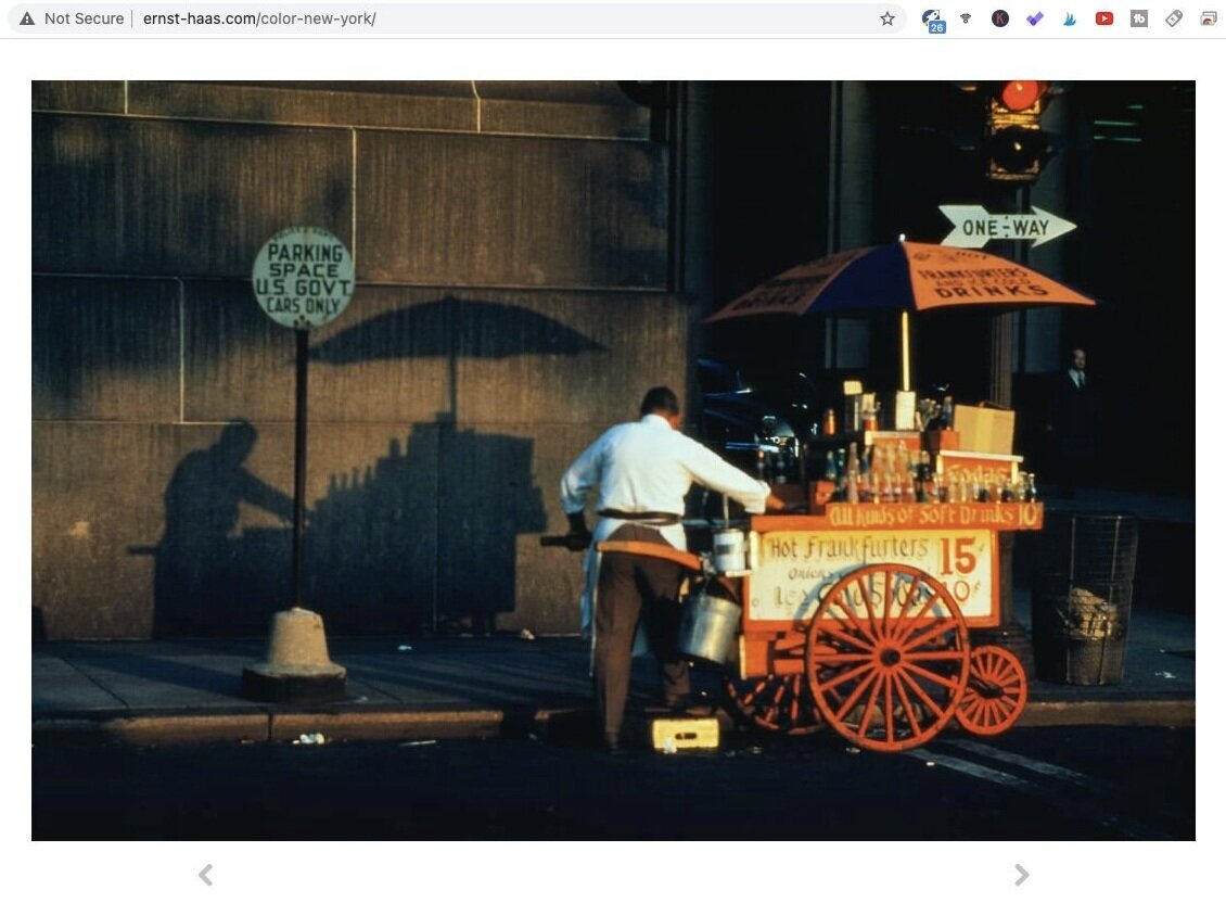
NY (1953). Photo by Ernst Haas. Screen shot taken from Ernst Haas Estate.
Here is an example of how shadows are used as a stand-alone subject. While the hawker is surely a subject, and you can go further to assert that it is the ‘main’ subject, its shadow is another subject. The shadow is a derivative of the hawker himself, but it pretty much functions as another subject which counters the physical hawker on the right. Plus, the gap in between the real object and its shadow does demonstrate an intention to create a composition consisting of two equal-weight subjects which would balance out each other.
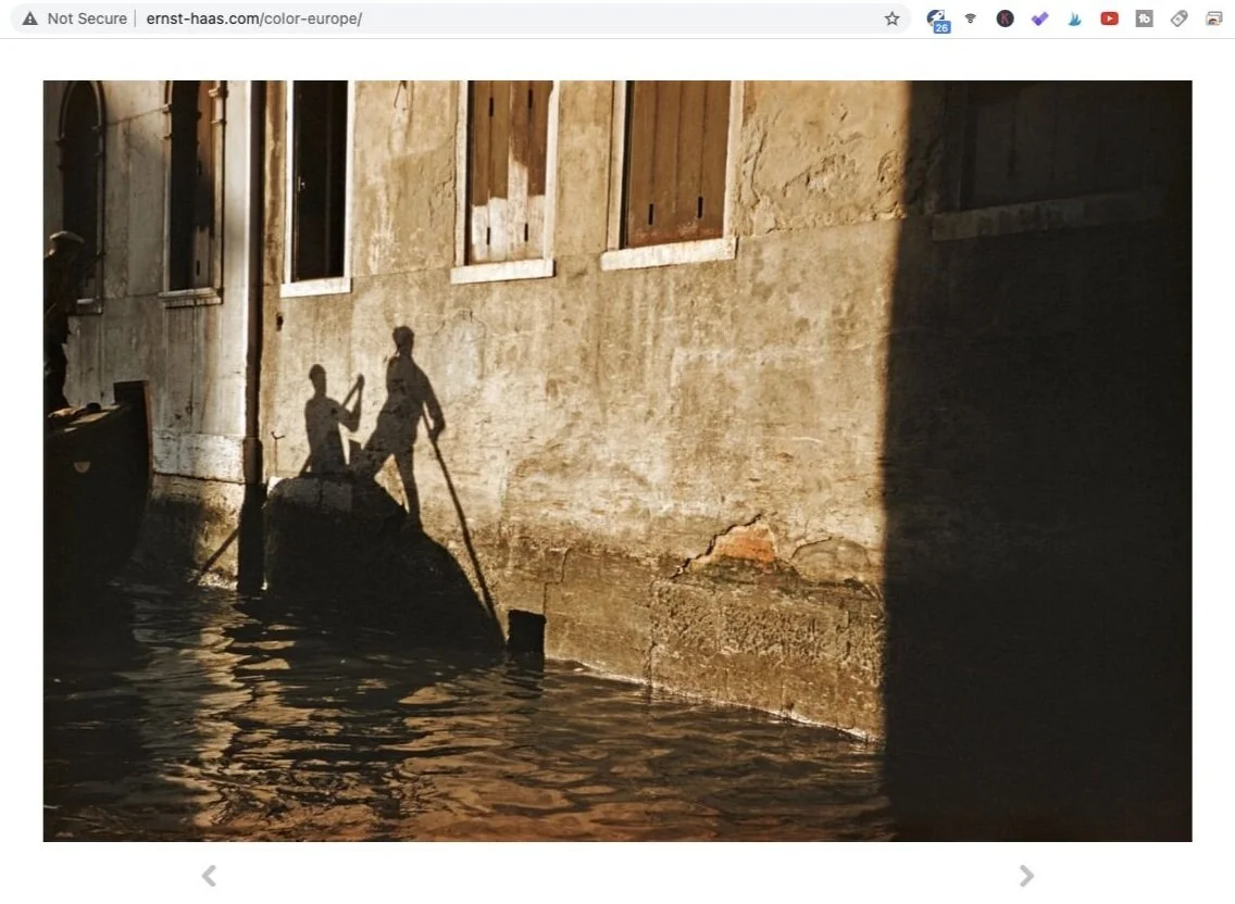
Venice, Italy (1955). Photo by Ernst Haas. Screen shot taken from Ernst Haas Estate.
Here is another image by Ernst Haas in which shadows were captured as the sole subject in itself, this time with the physical subject being barely visible. The shadow of the gondola and the gondoliers was placed on the left third as it was cast onto a brightly lit wall. If you look closely at the left border of the frame, you would see parts of what could very possibly be the actual gondola and one of the gondoliers. There was mostly likely some thought given to its inclusion in the frame, but for the most part the shadows were the protagonist in this image.
Alex Webb
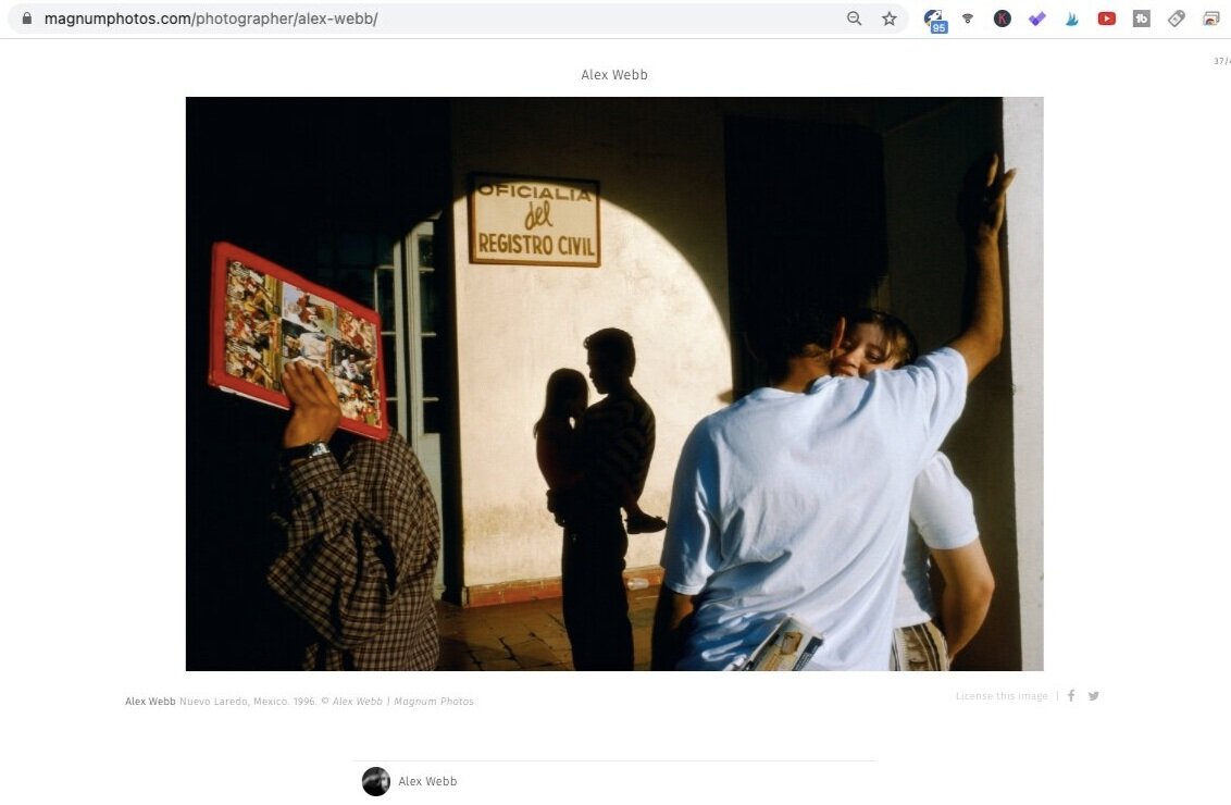
Alex Webb is yet again a very different photographer from the above, in my opinion, mainly in the way he layers out his images. Many of his most well-known images feel like frozen moments in a musical theatre. There are many mini-stories going on within the same frame, each contributing to parts of the overall image and yet does not overwhelm nor deduct from each other. Because of the inclusion of multiple groups in a single frame, Alex is very skilled in carving out more important elements with the use of shadows as sub-frames.
Nuevo Laredo, Mexico (1996). Photo by Alex Webb. Screen shot taken from Magnum Photos.
This image is a great representation of Alex’s approach. In this image, we can see three primary groups, one each on the left, centre and the right. An immediate concern in relation to including multiple units within the same frame is that they would fight for the viewer’s attention, but here shadows were adopted smartly to guide the viewer’s eyes. For one, the arch-shaped shadow circled out the silhouetted in the middle, and thus acted as a sub-frame.
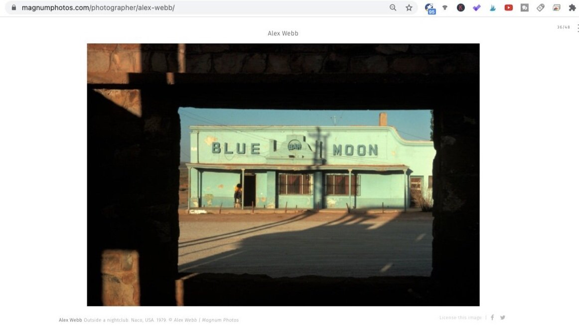
Outside a nightbclub (1979). Photo by Alex Webb. Screen shot taken from Magnum Photos.
In this image, the technique of sub-framing was incorporated squarely (no pun intended). The dimensions of the sub-frame happened to mirror that of the actual frame, and therefore demonstrates the technique perfectly. The sub-frame was formed by dropping the shadows into near-blacks, a characteristic quite consistent across Alex’s work, to draw the viewer’s eyes to the nightclub in the shot.
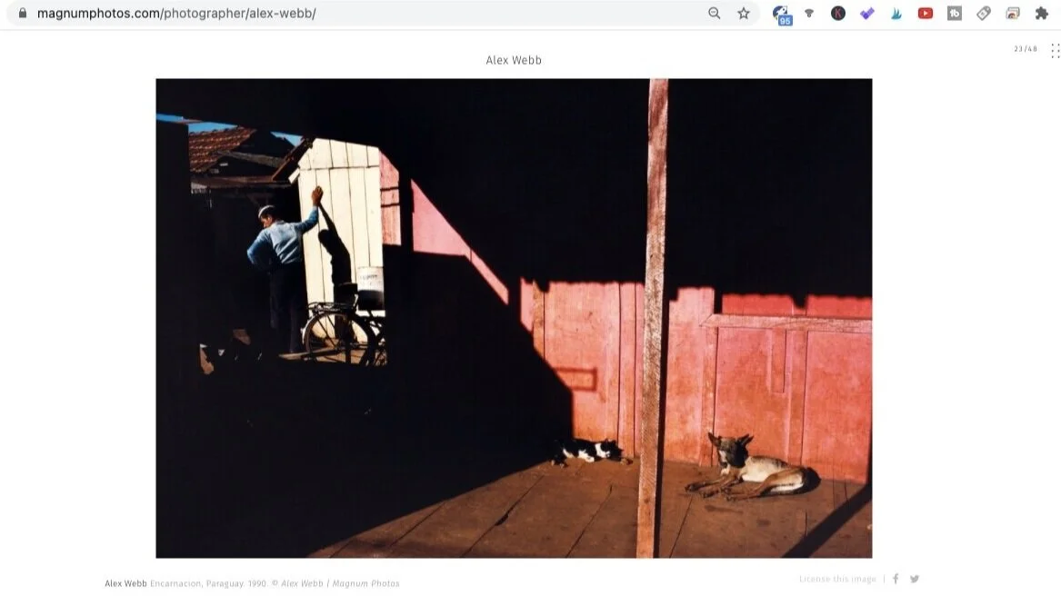
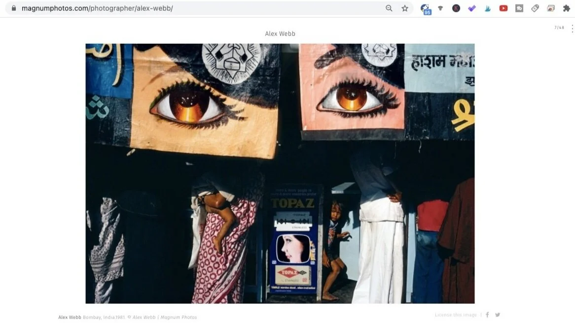
The below are more examples of the variations of the sub-framing technique achieved via the use of shadows, from Alex Webb’s Magnum page.
As we see in the above group of images, Alex gave the sub-framing technique his own spin. It certainly does not need to be in form of squares nor complete shapes for the shadow to do its magic; it can come in any shape or form, and knows no restrictions or regularities. The only goal of sub-frames is to draw the viewer’s eyes to what is important. Especially in complicated scenes, shadows come in very handy to divide the frame into sections.
Martin Munkacsi
Martin was from an even earlier time in the history of photography, and he his work was an interesting cross-pollination of street and fashion photography. He was incredibly talented in relation to incorporating shadows in his images to create interesting patterns and geometrical arrangements. Shadows often occur in form of lines and shapes in his work.
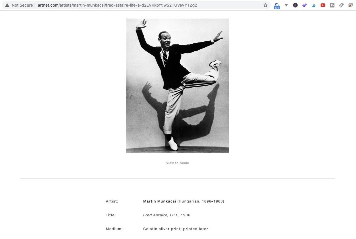
Fred Astaire (1936). Photo by Martin Muncácsi. Screen shot taken from Artnet.com.
Let’s look at this iconic portrait of Fred, shot by Martin by LIFE magazine. The lighting setup resulted in a compressed shadow falling on the wall behind Fred. This is an exceptional example of how shadows can be used to create interesting patterns that go with the main subject.
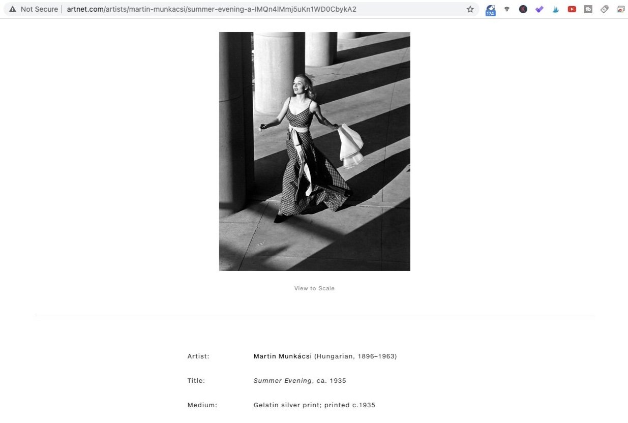
Summer Evening (1935). Photo by Martin Muncácsi. Screen shot taken from Artnet.com.
This is a classic treatment of high contrast lighting situations - creating sections of alternating light and shadows as sunlight shines through architectural structures. The strands of light function as leading lines, when read together with the vertical building support, converge towards the female subject in the shot.
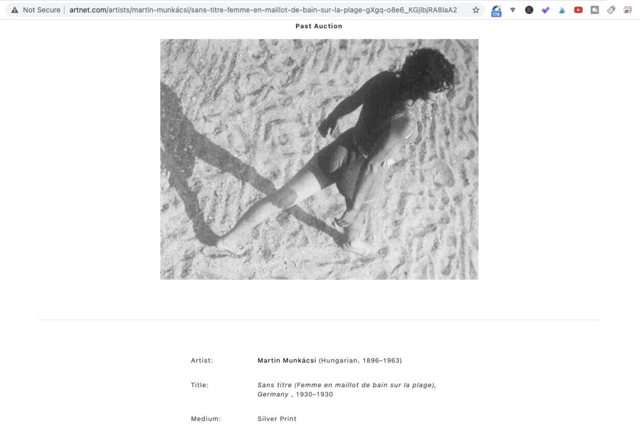
Sans titre (1935). Photo by Martin Muncácsi. Screen shot taken from Artnet.com.
This is yet another example of how readily Martin recognises patters shadows are capable of creating and use them to his advantage. With the appropriate angel of incidence of the sunlight and the right vantage point, the shadows left on the sand by this young lady perfectly closed up the geometrical shape which resembles a bow-tie.
Fred Herzog
Fred Herzog is known for his body of colourful street photography and in particular, I would like to point you towards his use of shadows in creating extra texture in his images. In this case, the shadows need not be as sharp and distinct as in some images we have previously gone through.
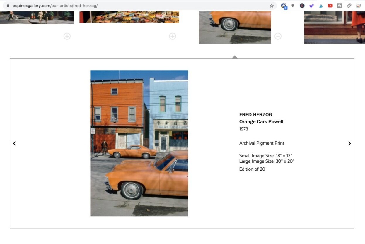
Orange Cars Powell (1973). Photo by Fred Herzog. Screen shot taken from Equinox Gallery.
In this image, the shadows are relatively faint but that does precisely what the photographer intends. Fred’s work was substantially influenced by the colour movement in America and therefore often features colour patterns as seen on streets. Here, the main point of the photo would be the colour contrast between the oranges and blues, and specifically, how the pair of complementary colours are arranged alternatively.
However, adding to the richness of the composition, we see light traces of shadows, which were likely created by tree branches, falling onto the cars and even covering the building walls on the far end. This added an extra point of interest in terms of texture, while not interfering unnecessarily with the overall aim of the image.
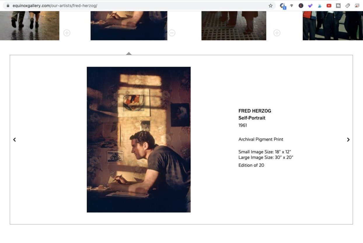
Self-Portrait (1961). Photo by Fred Herzog. Screen shot taken from Equinox Gallery.
A common treatment of light, in the context of creating interesting texture, is to overlay the shadow (or light, depending on how you see it) onto the subject, so that the light-shadow boundaries hit onto the subject and cuts through it. In his self-portrait, Fred purposely broke the pattern, which was created by what seems to be window frames, by overlaying it over himself, the subject in this situation. As a result, parts of him were in shadows while others belong to the highlights. This shakes things up and results in a more interesting visual appeal as opposed to, say, where he sits squarely within the area of the highlights.
Summary
In this article, we talked about:
The definition of shadow photography;
Common shadow photography techniques, and
Great photographers who used light and shadows in their work extensively, including Fan Ho, Henri-Cartier Bresson, Ernst Haas, Alex Webb, Martin Munkásci and Fred Herzog.
More sharing coming soon!
SUBSCRIBE via the box on the left for more PRO tips, and follow me on Instagram (@_bjiao__) and let me know what you think in the comments!
Share this article on Pinterest too!
Keep shooting, keep creating!
The mission of this blog is to provide the best insider information in the photography industry, as openly as possible. You have direct access to my
first-person experience as an aspiring photographer who talks, but also works.
Honest opinion are rarely available as public resources because this is a competitive industry. Huge sums are made when such information is delivered in the form of mentorship and workshops.
This blog is a great way in which I cover my daily expenses, but also provide real value.
If you have learnt something that would be worth at least $10, please consider donating to the page. This enables me to keep creating content and helping more people sustainably.
Your continued support for the blog is appreciated!

