Who and What Influenced Saul Leiter?
Dubbed the ‘New York Nabi’, Saul Leiter’s work exhibited a confluence of French Impressionism and Japanese Zen. As a painter himself, he owned paintings by household French names including Bonnard and Vermeer, and was knowledgeable in the history of art. Later images also show Japanese ukiyo-e prints by Utagawa Hiroshige and Hokusai, hung up in his studio walls, together with a rich collection of Japanese calligraphy, vinyl and books. In his formative years, photographer W. Eugene Smith and painter Richard Pousette-Dart encouraged Saul to pursue photography.
Japanese School of Artists - Zen
Japanese culture has influenced Saul Leiter’s work on many levels, both in terms of his approach and choice of subject matter.
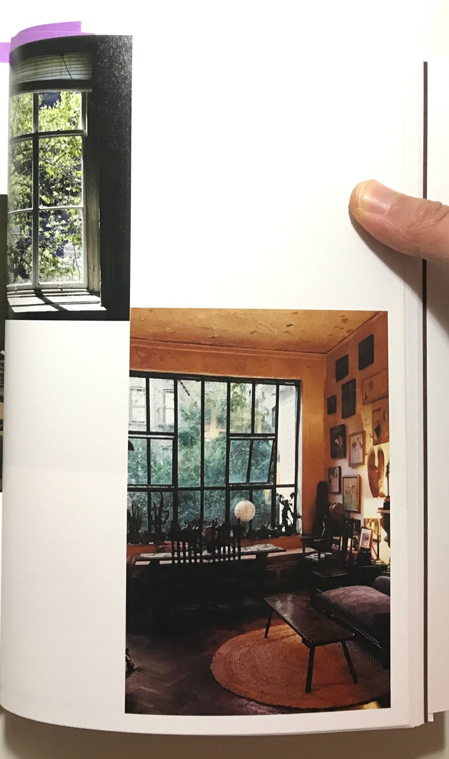
Saul loved all things Japanese, as images of his studio shows. These images are from the book “All About Saul Leiter” published by Thames & Hudson, still currently in print. Check out its latest prices on Amazon.
As described by Pauline Vermare, the curator of the exhibition “Photographer Saul Leiter: A Retrospective“, there were etchings of paintings by Koryusai hung on his wall; among the heaps of collected items were Japanese calligraphy papers, vinyl records of Japanese musicals, and a massive library of books dedicated to Japanese literature, poetry, ceramics, ukiyo-e and Zen.
Saul Leiter’s Approach to Street Photography
The philosophy and intentions behind the work of Saul Leiter had a strong resonance with principles of Zen Buddhism, which celebrates the living in the moment yet without attachment to earthly pleasures.
His approach to photography was therefore markedly different from that of his peers who photographed in the same post-war period in America. Many of them had a clear intention to document for social causes and used photography as a medium to raise awareness, or advance their views on certain public affairs.
Saul, however, remained largely apolitical, as far as his photographs were concerned. He was about capturing fleeting, ephemeral sightings in everyday life.
This is a shared characteristic also commonly found in Japanese ukiyo-e (translates into ‘Pictures of the Floating World’) prints, which has a strong emphasis on depicting the here-and-now, the banal fragments of being human.
Ukiyo-e print by Katsushika Hokusai, titled Ejiri in Suruga Province (Sunshū Ejiri). (1830-1832)
This is why Saul’s work exhibits a sense of timelessness - his pictures do not attempt to be more than what they are. It is a search of beauty in its purist form, absent the intention to stake a claim on cultural and socio-economic affairs.
Saul Leiter’s Subject Matter in Street Photography
A correlation can also be seen between Saul’s choice of subject matter and those often featured in ukiyo-e art - everyday life objects and elements of weather.
As we shall see below, where I offer a more technical analysis of his experimentations on street photography, there are certain motifs that recurred throughout Saul’s entire body of street photography. Some of those include umbrellas, taxis, shoes, hands - things that couldn’t be more ordinary, seemingly.
“I believe that the most uninteresting thing can be very interesting.“, Saul once said in his 2006 interview with Mitch Teich on WUWM’s Lake Effect.
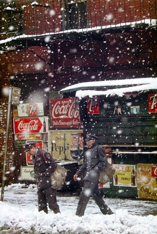
His work also involved heavily the depiction of weather conditions in New York City. The frequent appearance of snow, umbrellas and rain, is also a common theme among ukiyo-e prints, depicting the harmony between man and nature.
Overall, his desire to capture moving mundane aspects of living ties into his Zen beliefs.
French School of Artists - Impressionism & Les Nabis
Saul Leiter started off as a painter and was well-learned on modern art movements. In particular, he was the most fond of the post-impressionist artists Pierre Bonnard and Édouard Vuillard, both members of the group Les Nabis. (‘Les Nabis’ means ‘the prophets’ in French.)
The Nabis movement embraced concepts that Saul Leiter appeared to have carried over into his photography. As we will see in the section below regarding his photographic techniques, Saul was often attracted by bold colours, flattened and abnormal perspectives, which were common among the work of Les Nabis.
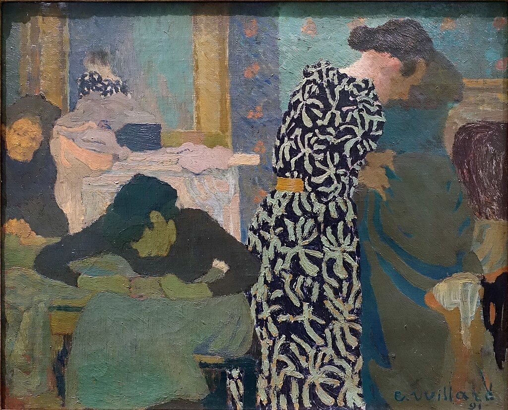
Painting by Édouard Vuillard, titled The Flowered Dress, (1891).
This painting by Vuillard exemplifies some fundamental characteristics of the Nabis movement - broad, rough brushes of color applied to create flat, abstract shapes, which collectively creates a sense of warped perspective of a scene of everyday life.
W. Eugene Smith and Richard Pousette-Dart
At the age of 23, Saul Leiter left rabbinical school and decided to pursue an artistic career as a painter. He started off as a painter, and befriended the photographer W. Eugene Smith and fellow painter Richard Pousette-Dart. The two were experimenting with photography and encouraged Saul to try out photography, a then up-and-coming artistic medium. Saul started off doing portraits for friends of friends, and eventually decided to try make a living as a photographer, which was what he eventually became known for, while painting personal works on the side.
What Camera, Lens and Film did Saul Leiter Use?
Saul Leiter was a great proponent of experimentation, and according to his interview with Vince Aletti in 2013, he shoots on a wide variety of setups.
For the majority of his career, he mostly shot on a 35mm film camera, later moving on to a digital full-frame camera in his later years. As for the lens, he enjoyed shooting on telephoto focal lengths.
When Saul started out as a photographer, he shot a lot with expired film stocks, firstly, to save costs but also to experiment with the muted colours that expired emulsions would create. Later as he became more stable financially, he moved on to shoot on all kinds of film stocks.
Saul Leiter’s Street Photography Techniques
Reflections & Layering
Reflections make a frequent appearance in Saul Leiter’s work. It was a pivotal means through which Saul combined two or more worlds into one, creating complex layering in his street photography.
See the below image, ‘Phone Call’, as an example.
Photo by Saul Leiter, titled ‘Phone Call’, (1957).
Here we see that Saul combined quite a few layers and flattened them into one. Firstly, there is a layer consisting of the window frame/ exterior wall of a space with glass panes.
Then, there exists a second layer consisting of people seated inside the space, as shot through the windows, featuring a man on his phone and other patrons. Thirdly, we can identify the reflection of a red bus as shown on the glass panes.
There are perhaps more faces going on, as you will notice as you study the image for a little longer.
Saul skilfully merged multiple layers into one, therefore creating a high level of abstraction in his work.
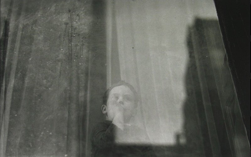
Photo by Saul Leiter, titled ‘Boy’, (1950).
Let’s look another example from Saul’s B&W collection, titled ‘Boy’.
Similarly, we see that the photo was shot through a window as indicated by the partial inclusion of the window frame on the right of the frame, making up the first layer.
We then identify that there is a boy and some textured curtains behind the window, which makes up the second layer.
Finally, the buildings were reflected against the window, rendering as a vague patch of shadows. All layers add up to convey a sense of flattened perspective.
Colour Contrast
Colour was a huge part of Saul’s experimentation with photography. He had a particular affinity with colour, and therefore his images often feature a high contrast in colour saturation. Some colours would stand out among the other muted ones, most notably reds, yellows and greens.
These blots of colour act as visual anchors directing the viewer’s eye, a shared commonality with the paintings of Les Nabis artists.
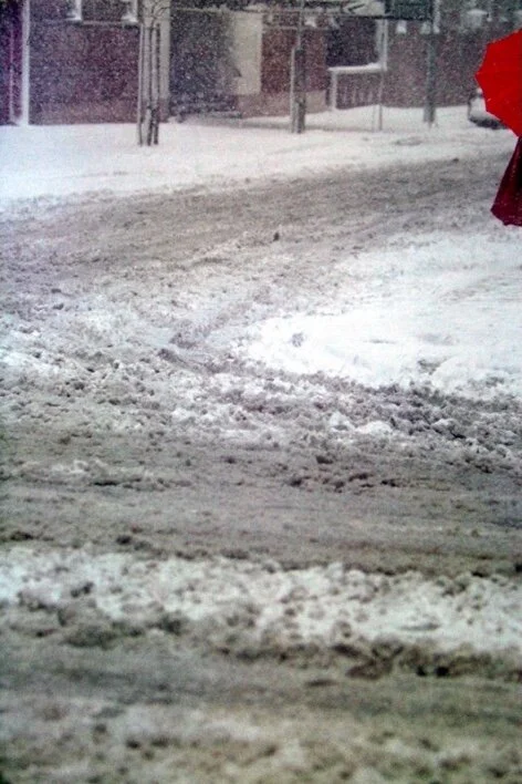
This photograph below, titled ‘Red Umbrella’, would be a fitting example.
Photo by Saul Leiter, titled ‘Red Umbrella’, (1957).
In this frame, we see a stark contrast between the bright, saturated blot of red, and the bleek, desaturated tones of the rest of the frame.
Immediately, the viewer’s eyes are drawn to the area of red, which showed a woman in a red dress with a red umbrella.
It is also worth noting how the patch of red is so saturated that it almost appeared flat, showing limited distinction between highlights and shadows. This bears a striking similarity with how the Nabis painted occasionally with paint directly from the tube without much mixing to create figures out of a uniform shade of colour.
Colour as Composition
Another vital function that colour plays in Saul’s work is that the colours themselves are the compositions.
The colour was often the main element that made up how the image was composed. Let’s look at an example below, titled ‘Harlem’.
Photo by Saul Leiter, titled ‘Harlem’, (1960).
In this image, the colour red is the essence of the composition - we are basically looking at the placement of patches of reds within the frame.
We see that these areas of reds were arranged in a asymmetric manner, the three main areas being the man’s tie on the lower left, the car in the middle, and the words in the background.
These three parts were roughly aligned to form a diagonal, balancing the image while creating a sense of dynamicity.
Photo by Saul Leiter, titled ‘Snow’, (1960).
In this image, we can begin by noting that the patch of yellow on the truck stood out, being highly saturated, while the rest of the image drops into relatively duller colors.
But the yellow area played the critical role of separating the man’s head from the background, so that the contours would be visible.
As a result, the viewer can then see that he was wearing a hat, looking downwards.
Saul tactfully used colour as building blocks in his images.
Sub-framing & Compartmentalisation
Also a prominent feature in the paintings of the Nabis, Saul Leiter often divided his frame into distinct sub-frames, either through drastic contrast in brightness, or as mentioned above, colour.
Firstly, let’s see an example of how compartmentalisation is achieved through the use of harsh shadows, separating areas of light and life.
Photo by Saul Leiter, titled ‘Bus’, (1954).
In this photograph titled ‘Bus’, we can see that there are distinct areas of dark shadows, edging towards pure blacks, and various shades of highlights, creating alternating blocks of shapes within the frame.
The dark ‘compartments’ are mainly the quarter of the wheel, the silhouetted man (even his spectacles are visible), and window frames of the bus that were backlit. These all fell into articulated areas of shadows.
On the other hand, scattered around the areas of shadows, we have rather strong highlights. For instance, the orange walls on the other end of the bus appeared to be much more brightly lit than the interiors of the car. The poster on the right also stood out in contrast with the darker area of muted greens.
Apart from the alternation between brightness tiers, the physical lines of the objects were skilfully incorporated as lines, which naturally cut up the frame into fragments.
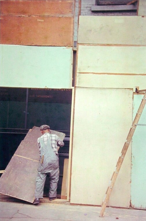
Photo by Saul Leiter, titled ‘Mondrian Worker’, (1954).
Here is how the same can be achieved in combination with the use of colour. There is also a patch of deep shadows towards the lower left corner in the frame, and that the borders of the objects themselves acted as lines that divided the frame.
But also note how the blocks of colour separated the frame into various sections.
The palette is pretty much made up of pastel colours, namely the faded orange on the top left, the turquoise-ish green below that and on the right edge, desaturated yellows filling up the majority of the right half of the frame, and the rest filled by muted tones of magenta.
There is a clear intention, throughout Saul’s work, to convey perspectives and space by creating distinct sub-frames inside the frame.
Negative Space & Asymmetry
The use of negative space was arguably the result of asymmetric compositions. This was also evident in the work of the Nabis, who broke away from the classical, western doctrines in relation to composition. Instead, they sought inspiration from the Japanese artists, who often placed their subjects in asymmetrical parts of the canvas, in conjunction with the common use of negative space. This also has to do with the concept of Mu (nothingness) in Zen Buddhism.
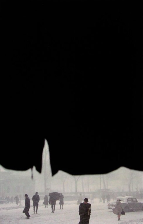
The epitome of the use of negative space in Saul’s work is probably ‘Canopy’, as shown below.
Photo by Saul Leiter, titled ‘Canopy’, (1958).
Saul often shot through gaps and layers of materials, filling a large part of his frame with what almost looks like a flat shape - in this case, plain black.
Also note how the action happening in the scene was placed towards the very bottom of the frame, contained in a slim strip.
In this example below, the negative space consists of whites, which took up the majority of the frame.
The main subject, as the title and the focus implies, is the suited man wearing a black hat a patterned tie, placed in the middle at the bottom of the frame.
Saul demonstrated a high level of maturity in his ways of seeing as a photographer, which means, unsurprisingly, that in his work, there are usually many things happening all at the same time.
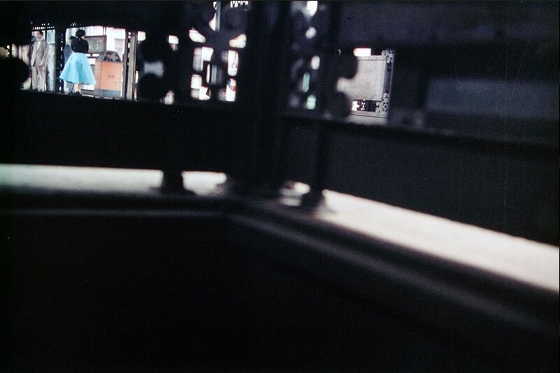
Here, we have an example of how Saul pulled everything together in one single image ‘Blue Skirt’ - the subject, which is a lady wearing a bright blue dressed, placed towards the upper left corner of the frame, boxed by an area of highlights.
Photo by Saul Leiter, titled ‘Blue Skirt’, (1950).
Apart from the use of saturated tones and the edge placement of the subject, also note the vast area in the frame being dropped into shadows, forming a void.
The pillar, which is supposedly the axis of symmetry, was shot slightly slanted, resulting in asymmetry between the left and right halves of the frame.
The alternation between areas of stark highlights and shadows figuratively cuts up the frame into three main sectors - the top left, top right and the bottom.
Recurring Themes & Experimental Projects
Saul Leiter was fond of Japanese Ukiyo-e prints and perhaps under such an influence, he photographed purely for the search of beauty.
Ukiyo-e prints had a strong focus on the ephemeral beauty surrounding mundane everyday life, depicting the fleeting nature of the present.
The street photography of Saul Leiter often too features elements of nature, of ordinary things that appear in daily life, in a rustic yet poetic manner.
Throughout his entire body of work, the below are themes and items that constantly comes up.
Elements of Nature - Rain, Snow, Fog, Water Droplets
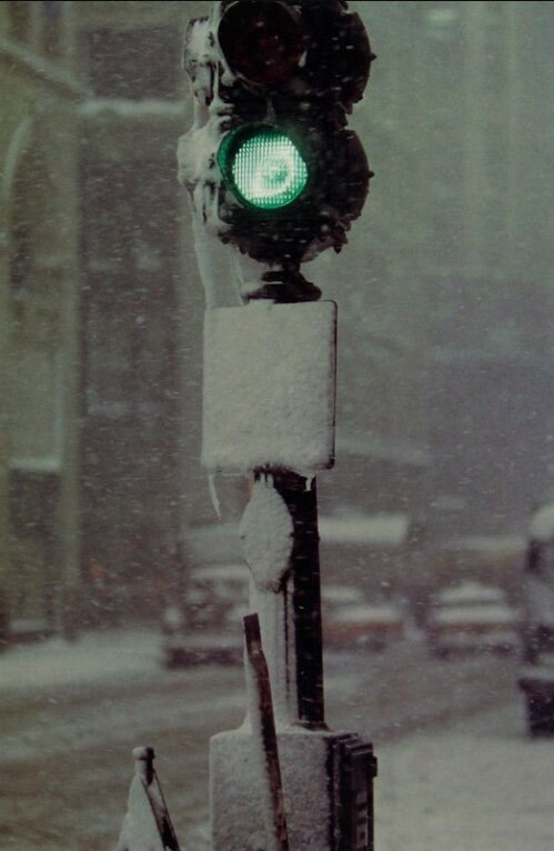
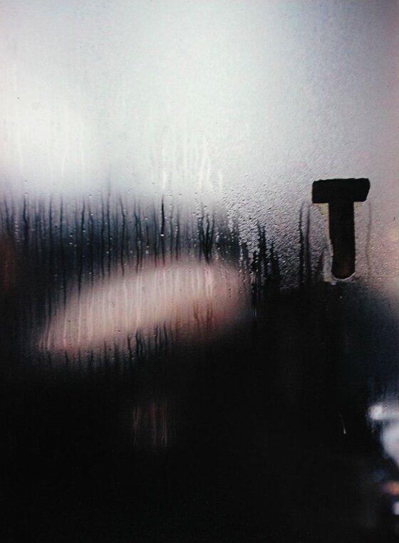
Saul gave considerable notice to naturally occurring elements and textures, a shared commonality with Ukiyo-e prints.
The weather makes up a huge part of the experience of being human - it affects our mood, our thoughts, it makes up how we feel, here and now.
Saul once said, “A window covered with raindrops interests me more than a photograph of a famous person.”. This explains why things like foggy glass, falling snow and wet surfaces always show up in his street photos.
Below are but a few examples from Saul Leiter’s archive.
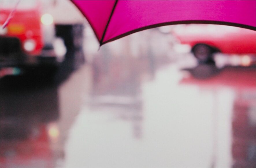
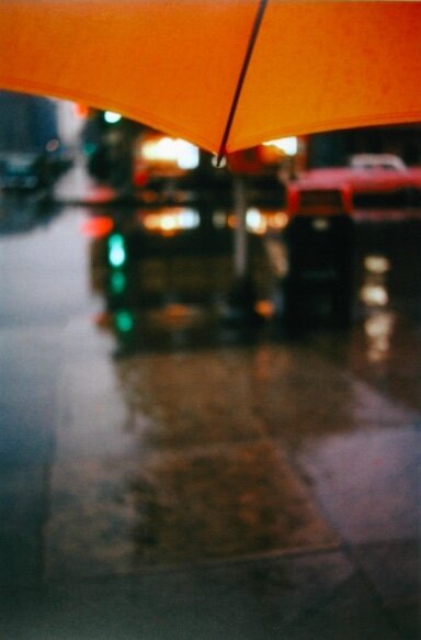
Umbrellas
Saul loved umbrellas. The monologue “All About Saul Leiter’ documented an instance as such:
"‘His (Saul’s) assistant once remarked in boredom: “Not umbrellas again!” to which Leiter simply replied: “I love umbrellas!”.’
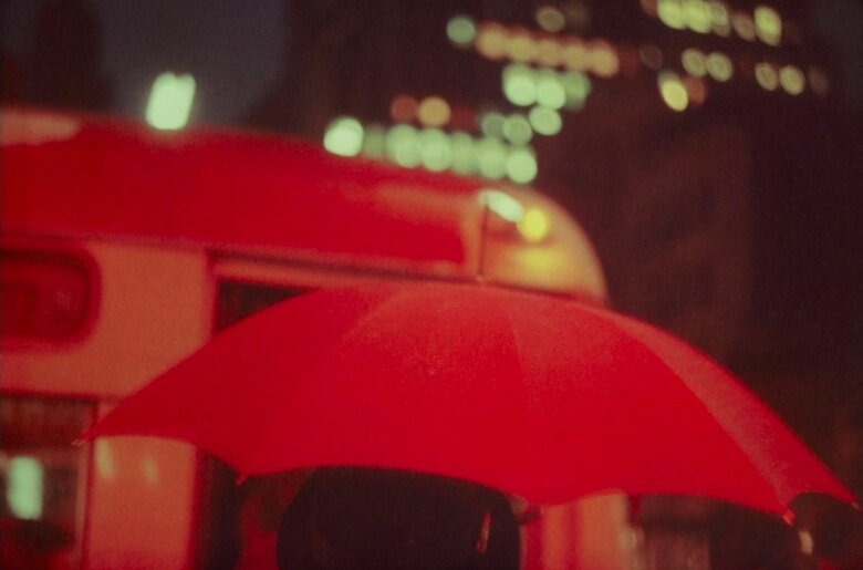
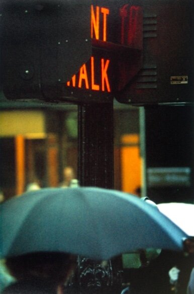
Out of his fascination with umbrellas, and specifically, brightly coloured umbrellas, they made a frequent appearance in his work.
When viewed in this perspective, we can arguably deduce that Saul enjoyed searching for scenes with umbrellas and capturing the beauty therein.
Here are but a few iconic street photos of his that featured the umbrella.
Hands, Feet & Shoes
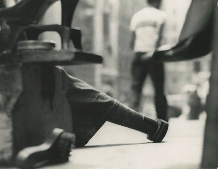
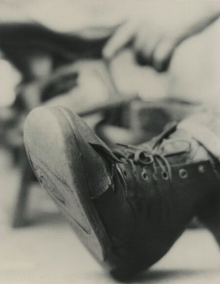
Perhaps a convenient thing to do, when you are shooting on telephoto focal lengths, Saul often photographed downwards at people’s feet, shoes and hands.
There is a series of images that go under the title ‘Shoe of the Shoeshine boy’ done in 1950, as shown below. We can’t be entirely sure what exactly the motivation for shooting these close up shots of shoes was for Saul, but it is interesting to learn that Saul occasionally devoted himself into mini themed projects based on what interested him on the streets.
Saul also did other shots featuring hands and legs, which are relatively less cropped-in than those above. The main appeal here, as it seems, is the geometrical arrangement of lines implied by the limbs, as well as a study of the subtle dynamics of the street.
For instance, this is an image of a suited person’s hands, and a couple of women’s feet towards the top left corner.
I especially like how the movement, represented by the motion blur in the women’s feet, is juxtaposed against the man’s waiting, as indicated by his stature and his hands.
Saul once noted that “A person’s back tell me more than the front.”. Along a similar vein, I see why Saul often photographed hands and feet - because they were very telling too, about what the person was experiencing.
Photo by Saul Leiter, titled ‘Hands’, (1954).
Hats
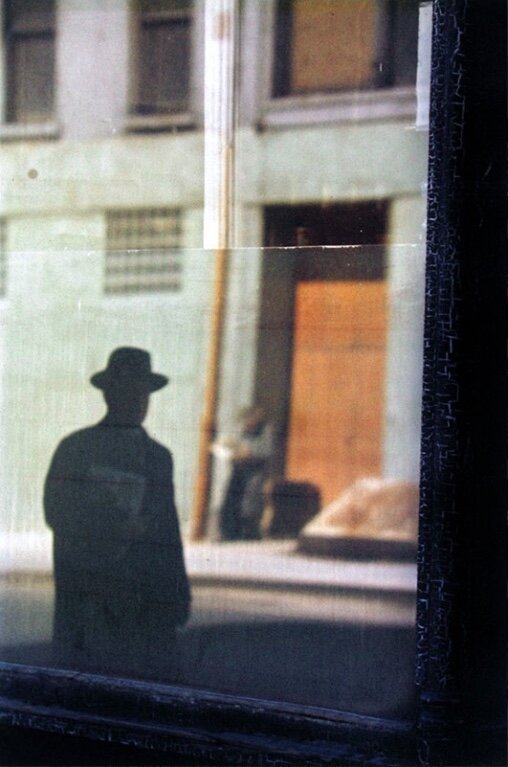
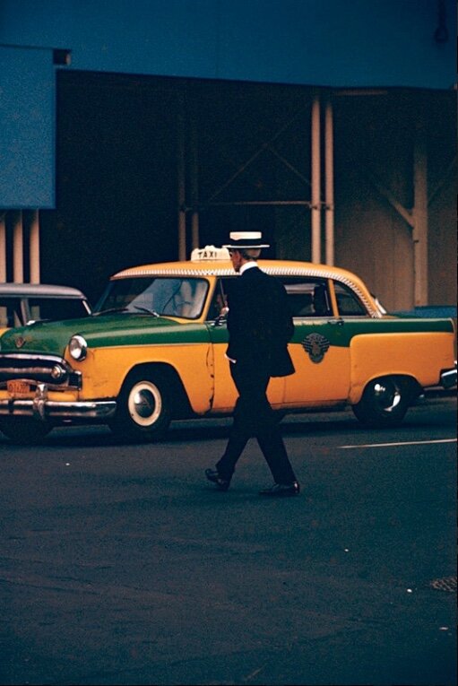
Saul had a massive fascination with hats - hats did not make occasion appearance, but were there from the very beginning, in his early black and white work, all the way to the colour work that he shot on streets.
Ted Forbes, who runs the Art of Photography show, made an association between Saul’s fondness with hats and a photograph taken by Vuillard, also featuring hats, in this video below. He presented a refreshing perspective of how Saul’s photography crossed-over with the photographs of the painters he admired.
Perhaps there were other reasons why Saul found hats such an appealing subject to work on in his street photography, again we cannot know for sure.
But we see a clear intention of progressing through his street photography experiments with a thematic approach.
See below for some of his street photos featuring hats.
Sometimes they appeared as silhouettes, sometimes they popped from the background. Sometimes they were static and articulated, sometimes they were blurry and fluid.
The more you study the work of Saul, the more variants you see of the hat playing out in his street photography.
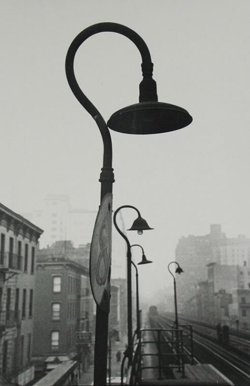
Train station - The EL
Saul was known for mostly photographing in his neighbourhood in the East Village, New York. The train station featured thick metallic structures, which eventually were extensively incorporated into Saul’s work.
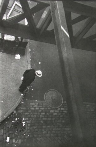
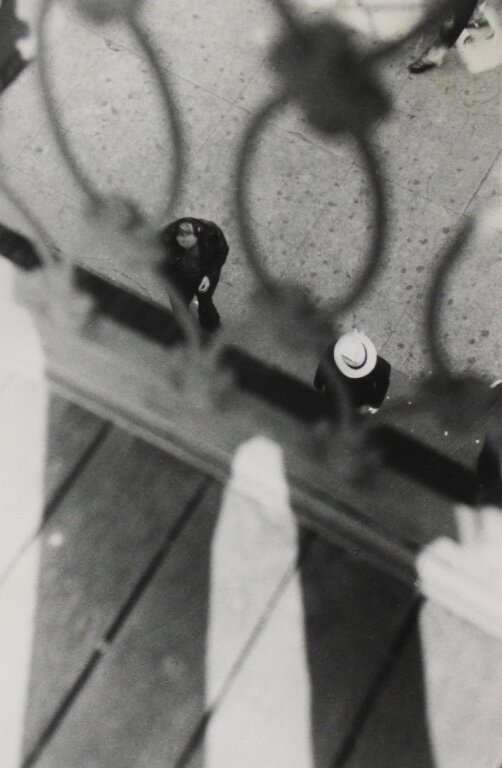
Saul often shot from the El. These structures enabled him to create unique compositions and shoot from the unusual angle from above.
As we can see from the examples below, Saul often made use of the barricades and architecture and shot through them to create sub-frames and geometric patterns.
As Saul put plainly himself, ‘I (Saul) take photographs in my neighbourhood. I think that mysteries things happen in familiar places. We don’t always need to run to the other end of the world.’.
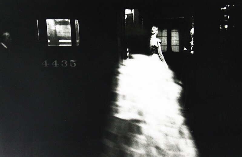
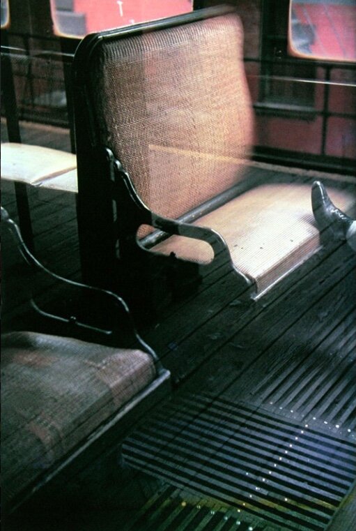
This largely accounts for his frequent excursions to the train station, and his images frequently taking place on trains, as some of these images below suggest.
The Best of Saul Leiter’s Quotes
“There are the things that are out in the open and then there are the things that are hidden, and life has more to do, the real world has more to do with what is hidden, maybe. You think?”
“Some photographers think that by taking pictures of human misery, they are addressing a serious problem. I do not think that misery is more profound than happiness.”
"We live in a world full of expectations, and if you have the courage, you ignore the expectations. And you can look forward to trouble."
Summary
In this article, we talked about:
Saul Leiter’s influences;
An analysis of Saul Leiter’s street photography techniques and philosophy;
Saul Leiter’s quotes
More sharing coming soon!
SUBSCRIBE via the box on the left for more PRO tips, and follow me on Instagram (@_bjiao__) and let me know what you think in the comments!
Share this article on Pinterest too!
Keep shooting, keep creating!
The mission of this blog is to provide the best insider information in the photography industry, as openly as possible. You have direct access to my
first-person experience as an aspiring photographer who talks, but also works.
Honest opinion are rarely available as public resources because this is a competitive industry. Huge sums are made when such information is delivered in the form of mentorship and workshops.
This blog is a great way in which I cover my daily expenses, but also provide real value.
If you have learnt something that would be worth at least $10, please consider donating to the page. This enables me to keep creating content and helping more people sustainably.
Your continued support for the blog is appreciated!


